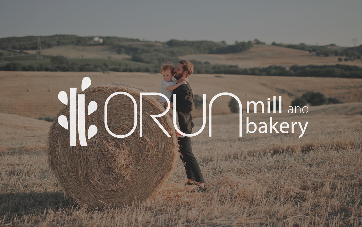
ORUN / Mill and Bakery Company
Brand identity
Orun Mill and Bakery is a company specialized in producing high-quality flour and bread. The use of advanced technologies and an experienced team of employees makes this business an excellent choice for consumers' needs.
One of the main features of Orun Mill and Bakery is its dedication to the health and well-being of consumers. The use of natural ingredients and carefully controlled processes ensures that their bread and flour are healthy and fresh.
Additionally, the company has a good reputation for excellent customer service and commitment to the community. With Orun Mill and Bakery, you can be confident that you will receive the good and delicious products you need.


Concept - The logo of Orun Mill and Bakery is constructed by combining the letters O, U, N and incorporating the icons of bread and wheat. This fusion creates a beautiful and symbolic design.
The letters O, U, and N represent the company's initiative and dedication to providing excellent products and outstanding services. The icons of bread and wheat are timeless symbols of freshness, quality, and bread production tradition.
This combination symbolizes the strong connection of Orun Mill and Bakery with the bread production process and their commitment to offering the finest products in the market.
Their logo is an expression of pride and their vision to be leaders in the bread and flour industry.


Typography - The Orun logo features two fonts to create a stunning visual representation. The Kiona Regular font embodies an elegant and modern feel, while the Myriad Pro font adds a touch of professionalism and readability. The combination of these two fonts creates a unique visual identity for Orun, blending style and reliability in a harmonious manner.

Color Palette - The Orun logo showcases a beautiful combination of three colors: yellow, white, and black. The color yellow symbolizes inspiration, freshness, and happiness, giving the logo a positive and energetic feel. The color white represents infinity, purity, and simplicity, providing a sense of balance and elegance to the logo.
Meanwhile, the color black adds sophistication, elegance, and mystery. The harmonious blend of these three colors in the Orun logo creates an appealing visual identity that reinforces the brand's values and characteristics.


